Sojourn Family Medicine
Logo Design
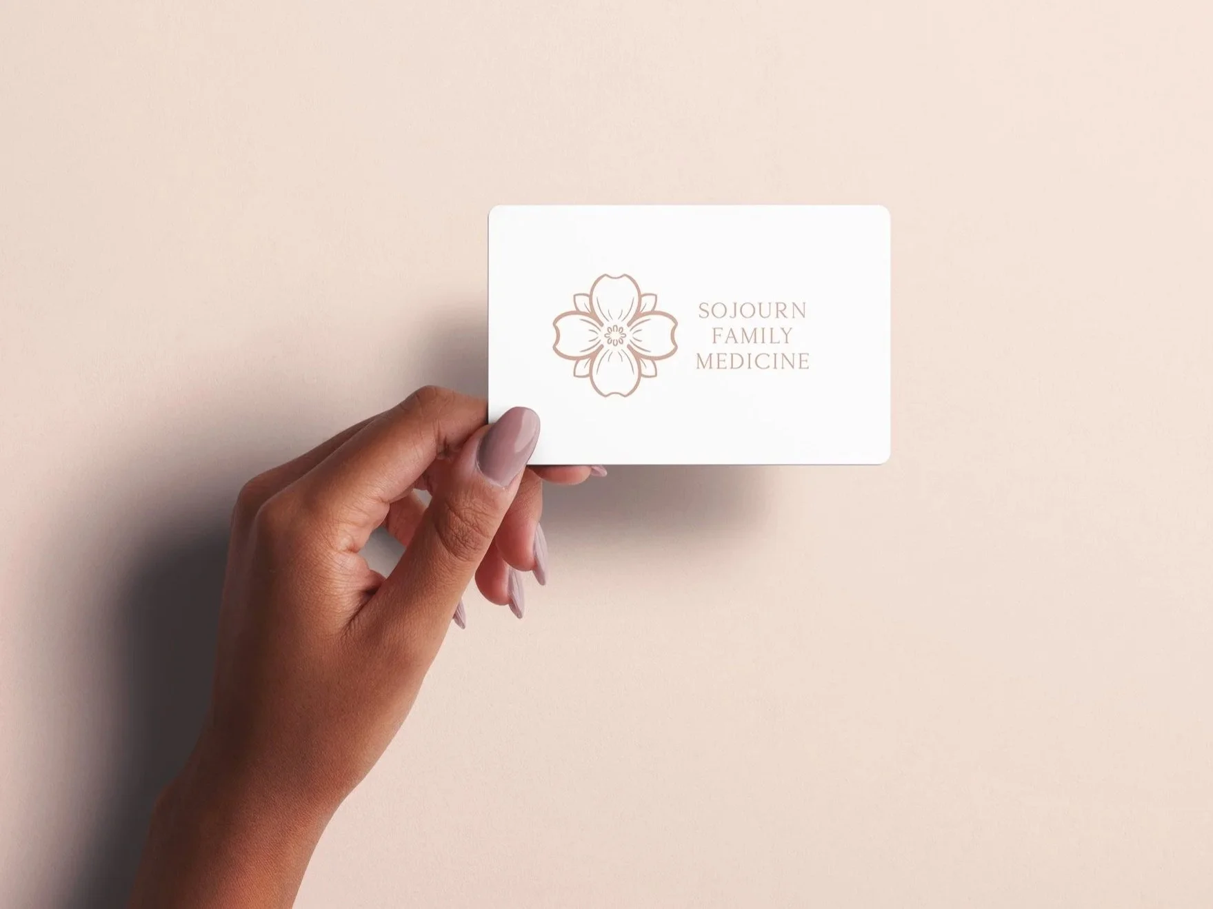
Sojourn Family Medicine is a direct primary care practice built around warmth, relationship, and deeply personal care. Dr. Sarah Florence came to the project with a thoughtful name and a clear philosophy: every patient is on a health journey, and her practice should feel like a welcoming place to pause, be cared for, and continue forward with support.
The visual identity needed to feel safe, grounded, dignified, and personal, while still carrying the professionalism expected of a medical practice. Inspired by Sarah’s brief, I explored ideas of hospitality, relationship medicine, natural earth tones, and the flowering dogwood as a symbol of welcome and patient care.
The final logo centers on a refined dogwood mark paired with an elegant, highly legible wordmark. A soft rose/brown palette gives the brand warmth without feeling overly delicate, creating an identity that feels calm, trustworthy, and personal across print and digital applications.
Final logo in use on Sojourn Family Medicine’s Website
Need a logo or branding for your medical practice?
Your healthcare brand should feel as thoughtful and trustworthy as the care you provide. I design logos and visual identities for doctors, private practices, clinics, and healthcare offices that need to feel professional, warm, and personal from the very first impression.
Whether you’re opening a new practice, refreshing an outdated logo, or building a brand that helps patients feel at home, I can help create an identity that reflects your values and sets the right tone.