Sjø Water
Logo and Packaging Design
Sjø Water is a premium hydration brand combining naturally oxygenated mineral water with hand-harvested sea salt. I created the logo and packaging design for the brand, developing a visual identity that feels clean, minimal, and rooted in nature.
The goal was to create packaging that reflected the purity of the product while standing apart from typical bottled water brands. Because Sjø is built around simplicity, natural sourcing, and minimal processing, the design needed to feel refined without looking over-designed. I focused on a quiet, elevated visual system with restrained typography, generous space, and a logo that feels modern, balanced, and memorable.
The final identity and packaging communicate a sense of freshness, clarity, and Nordic-inspired simplicity. The result is a brand presence that feels premium and trustworthy while staying closely connected to the product’s natural origins.
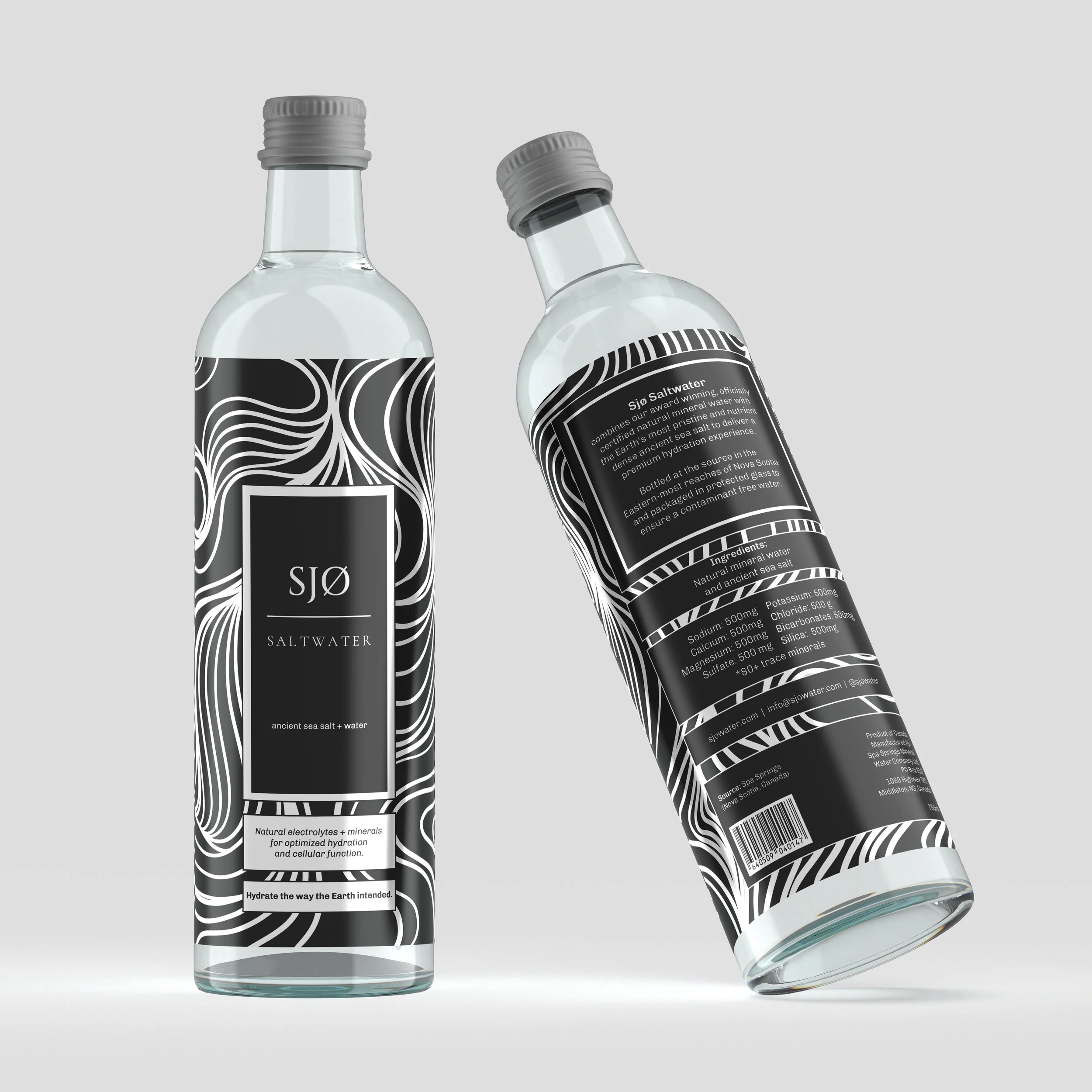
Label on bottles
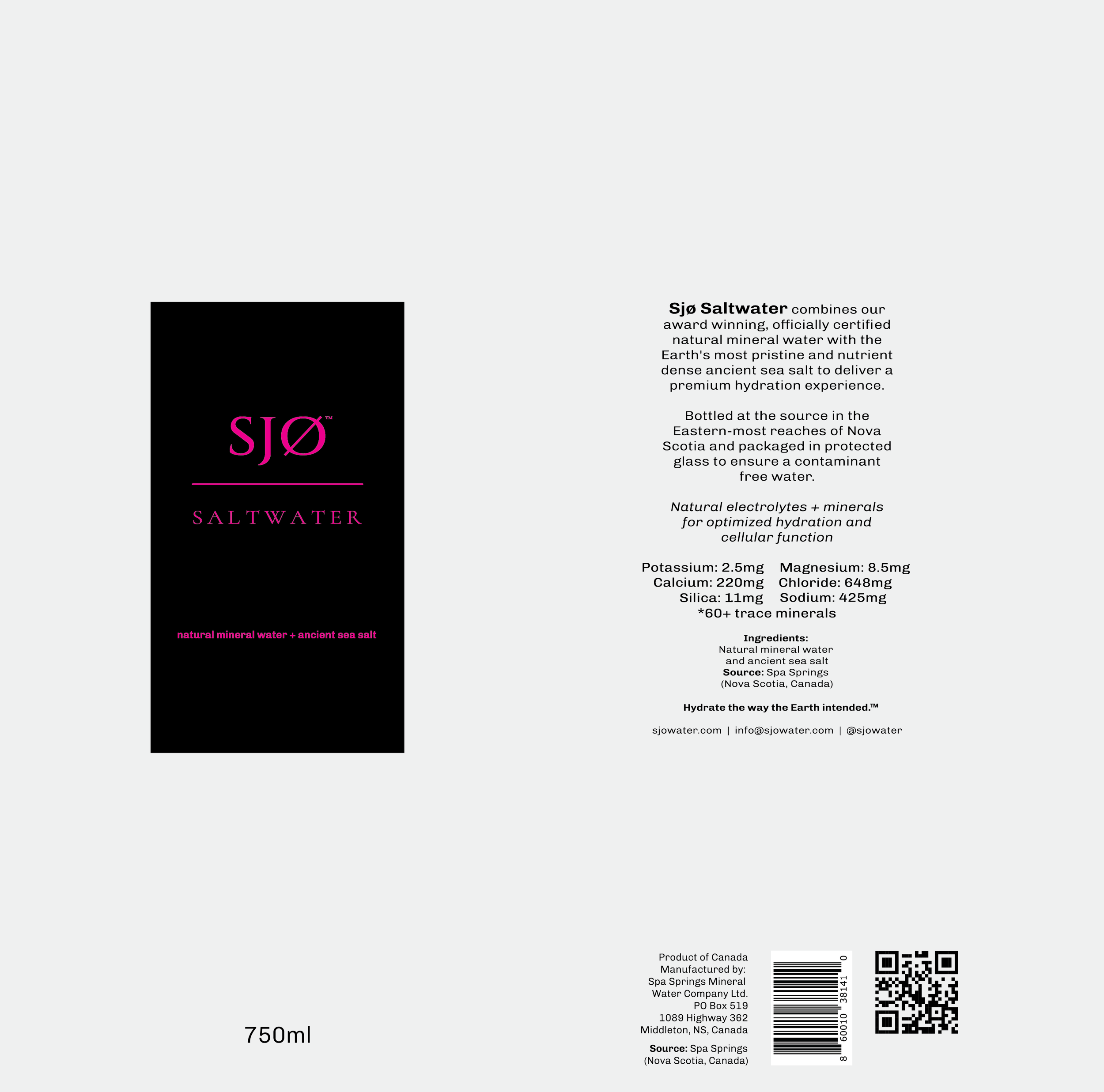
Flat label design
This project brought together brand identity, logo design, and packaging to create a visual system that felt clean, premium, and rooted in nature. By using a minimal design approach, refined typography, and simple packaging details, the brand was able to communicate purity, freshness, and trust while reflecting Sjø Water’s connection to natural ingredients and elevated everyday hydration. Do you have a product that needs a thoughtful visual identity?